Supercharge your data.
Metrics & KPIs
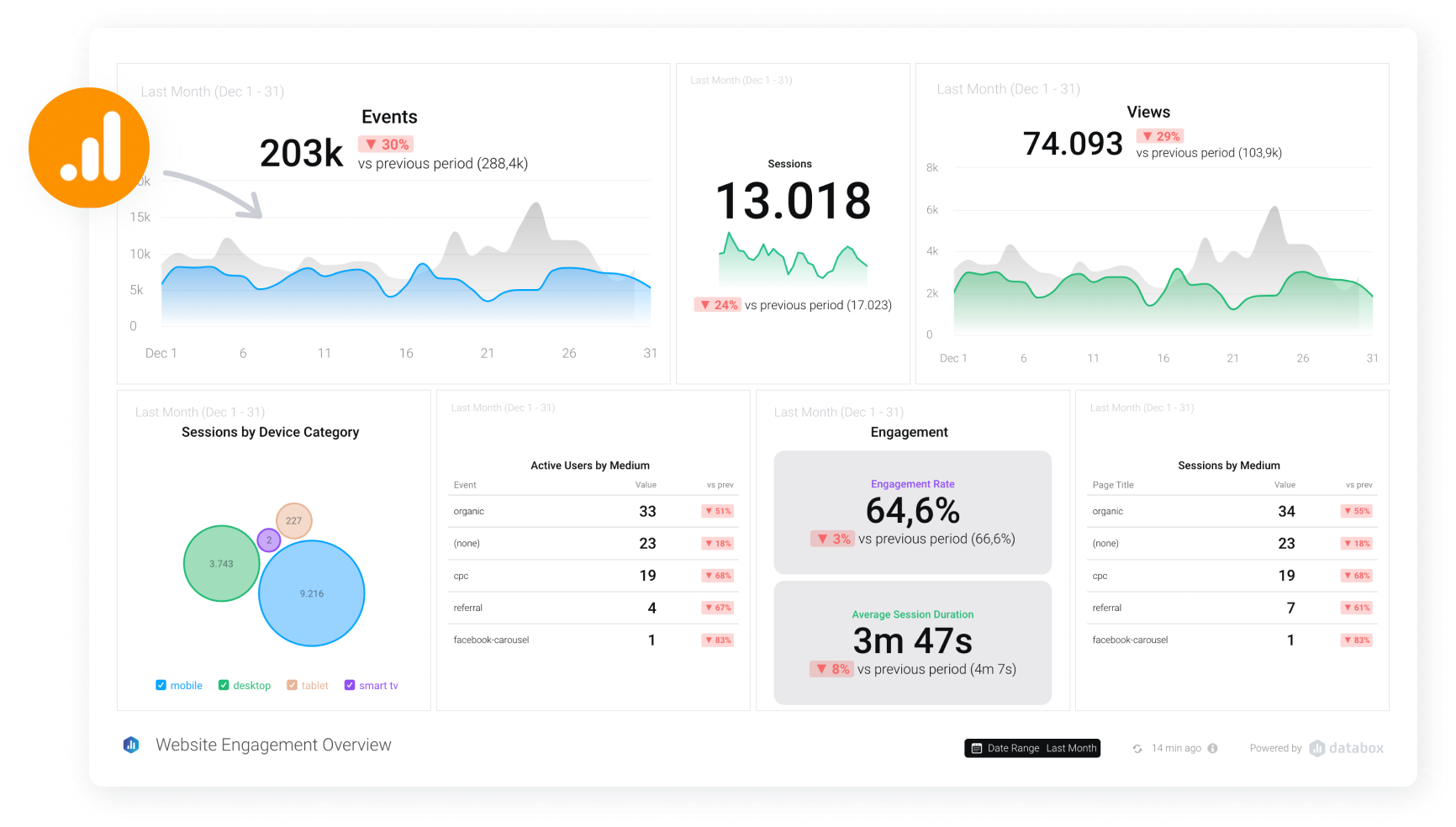
Visualize your company’s most important metrics in one place.
Dashboards
Create custom dashboards in minutes, without code.
Reports
Put your reporting process on autopilot. Create and schedule your custom reports.
100+ Integrations
Connect all your data, then use to make better decisions and improve your performance.
Forecast
Forecast the performance of any metric next month, quarter, or year and make more accurate plans today.
Goals
Track every team’s goals in one place.
Drag and drop builder • 1-click templates
Visualize Performance.
Build beautiful dashboards to uncover new insights.
Share Performance.
Create custom presentations and share them automatically.
Questions?
You can integrate with all Aero products. In addition, we have 100+ integrations including Google Analytics, Facebook Ads, Custom Excel Sheets, and more.
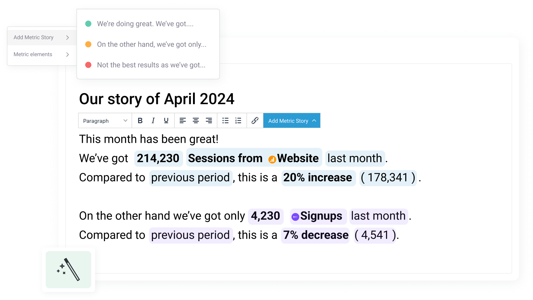
Data Stories are dynamic elements (like metric name, value, comparison periods, and more) that you can add to the text of your Reports. What makes it useful is that these dynamic fields are automatically updated with the latest data every time you send out a Report.
Our business reporting tool allows you to share multiple ways:- Download as PDF: You can choose to share your Reports by downloading them as PDFs. This format allows you to easily share via email or store your reports as needed.
- Send to Email: You can send an email (either immediately or scheduled) to any email address from within the Reports Editor. All you have to do is enter the recipient's emails, the subject of the message, and any additional text you would like to include.
- Send to Slack: Reports can also be sent to Slack channels, either immediately or at a scheduled date and time.
- Automate: You can set a schedule to automatically export the Report daily, weekly, monthly, or quarterly.
Yes, dashboards in Aero Analytics are interactive. Here are a few ways you can engage with the data:1. Hovering over data points to view specific values.2. Adjusting date ranges for individual visualizations.3. Updating visualizations with a single click.4. Choosing which lines (metrics, trend, goals) to view on charts.
You can change the colors of your dashboards, charts, reports, etc. And customize the logo on your dashboards to reflect your brand.